
domingo, 22 de setembro de 2019
Some chart examples
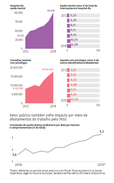
The following charts follow in a good way the priniple of information density presenting various thematical aspects on one page. On the other hand shows some deficiencies regarding the scaling and time and structure rules of IBCS. The chart on the right side is also a time presentation and thus should be shown in a time series as the left chart. For better understanding the percentages could be placed in the left chart building a combination chart. Or even above the area chart using a line chart for example. Thus all the page width could be used as for example shown in the chart at the bottom.
The most problematical visualization point is that scaling is obviously totally neglected. All 4 area charts deal with number of services and vary from 100 000 to 25 million service calls. In order to see the real situation the charts should show the vast differences by using a correct scaling.

The following chart is much better because it follows the rules of correct scaling.
And thus beyond being impressive also becomes reliable.
For better orientation it could have been helpful to mark the year when the uninterrupted population increase started.

Assinar:
Postagens (Atom)