Unfortunately
the theme of visualization of Covid-19-Data continues with the ongoing pandemic. Most of us never could imagine that this virus within his
almost 1 year of existence could have infected more than 90 million people
worldwide and caused the loss of more than 2 million lifes on earth.
If we see the numbers in charts we rarely can imagine
the impact of the disease on the different levels like continental, regional
and per country.
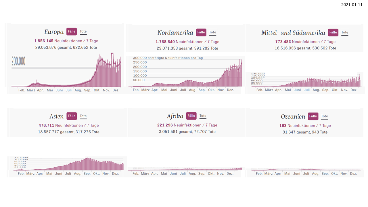
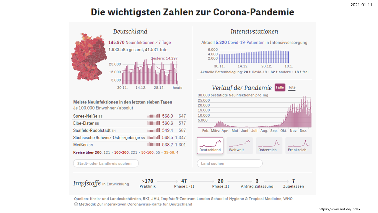
What can we see is that certain charts changed their
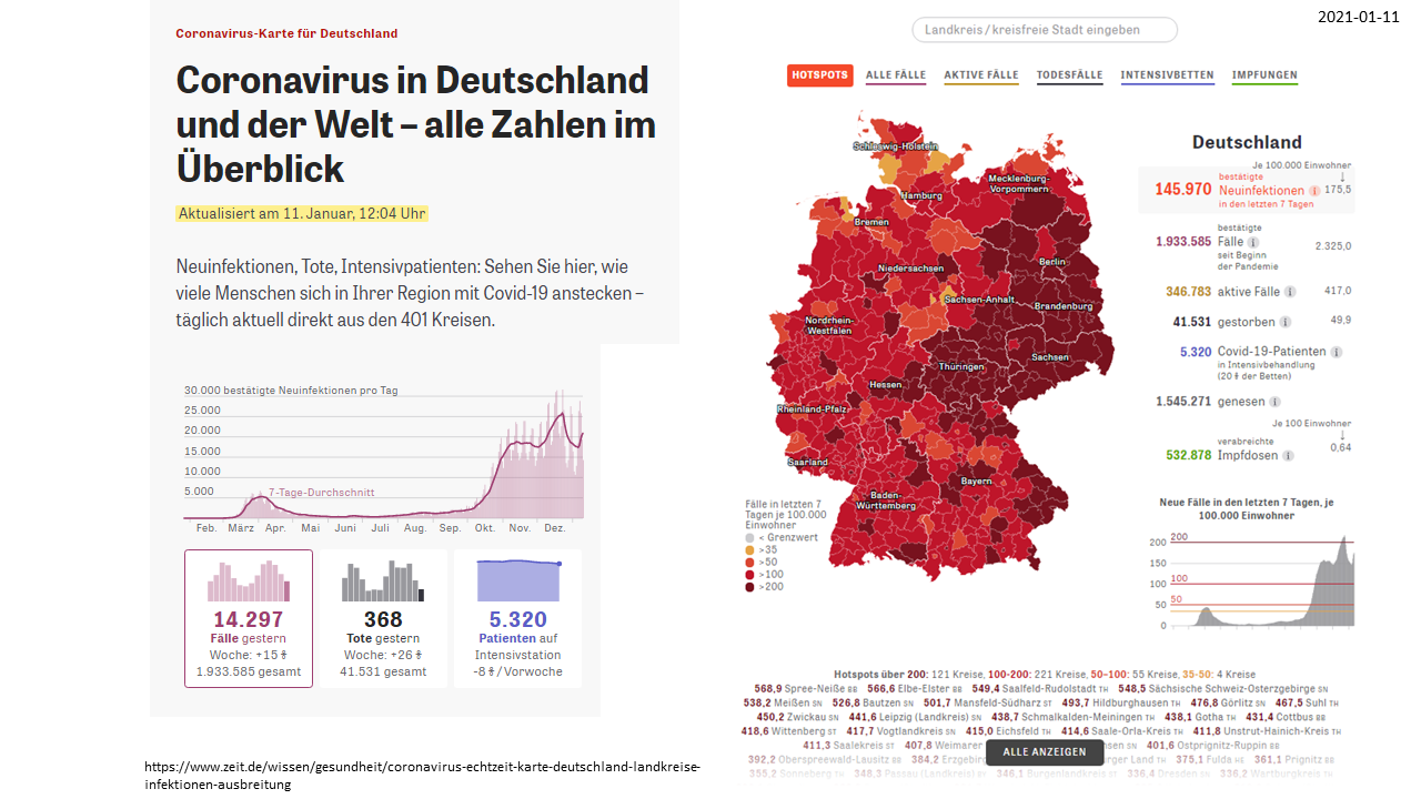
layouts by time. For example the German overview chart received a new item on “vacine”
due to the fact that there are now several vacines available and the number of
infections should decrease within a certain space of time.
When looking at the curves of regional and country
based overviews we can observe that it is almost impossible to compare their magnitudes
as they apply different scales of measure.
An important step in getting insights is comparing
data. Comparing could be done by putting charts of different countries or
regions into one overall chart. When we do this, as can be seen, correct
scaling becomes crucial.
Without scaling we can follow the curves and get an
idea of the trends over time, but fails to compare one with each other. But we
should do this, because without comparing we won’t formulate important questions
like ”why are incidences in Asia compared to the Americas and Europe are so
low?” and start investigating the reasons for those facts.


the curves tell a trend - but not a comparable magnitude