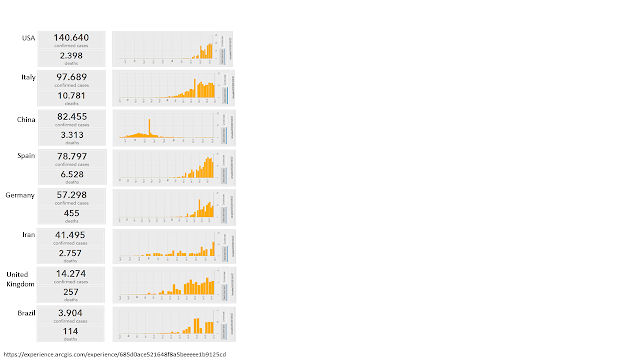
The last chart in last months contribution showed a timely presentation of the total number of worldwide infections.
For a timely presentation it would be better to show the bars on a x-axis. It would be also interesting to show the most affected countries in relation to the worldwide total and applying unique scaling.
The following chart shows an attempt to resolve this.
For better understanding it is not necessary to show in each chart all the lines of the other countries. Removal of background color and redundant labelling could also facilitate a better reading.
https://www.ft.com/coronavirus-latest


