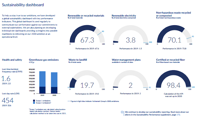
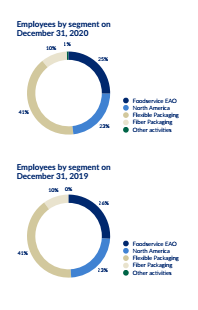
Annual reports are a very good example for how companies present themselves to the public and future investors. If one would like to give a fast overview and transparent look on a company most would follow the proverb “A picture tells more than thousand words” and use graphical presentation in abundance to give deeper insights for the interested reader. Or in other words inform than entertain, especially in our growing information economy. Thus we could expect annual reports with lots of charts and detailed information. But what we can see over the last years is a revival of textual information and a new puritanism when it comes to graphical presentation. Besides of the low number of charts we can observe mainly three types of charts like circles, columns and lines and as textual type a lot of low-level tables. Especially circles and their subforms like donuts are overwhelmingly used for almost every type of content. Could it be, that better reading and faster understanding (i.e. transparency) isn’t one the principal goals of companies in informing their public?
Basic ingredients for the graphical presentation of information in this annual report. (https://www.huhtamaki.com/en/investors/)
What informs better in the above chart? Donut or bars and lines?


