Em seguida uma coleção de gráficos do CCR 2017 - Relatório Anual e de Sustentabilidade. Sem muito "ruído", mas com o potencial de melhorias....


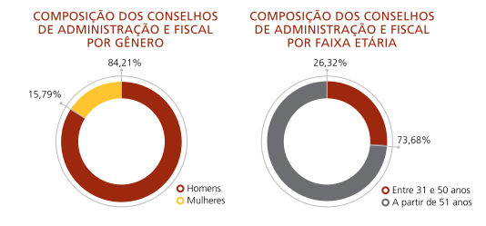


Em seguida uma coleção de gráficos do CCR 2017 - Relatório Anual e de Sustentabilidade. Sem muito "ruído", mas com o potencial de melhorias....
Unfortunately
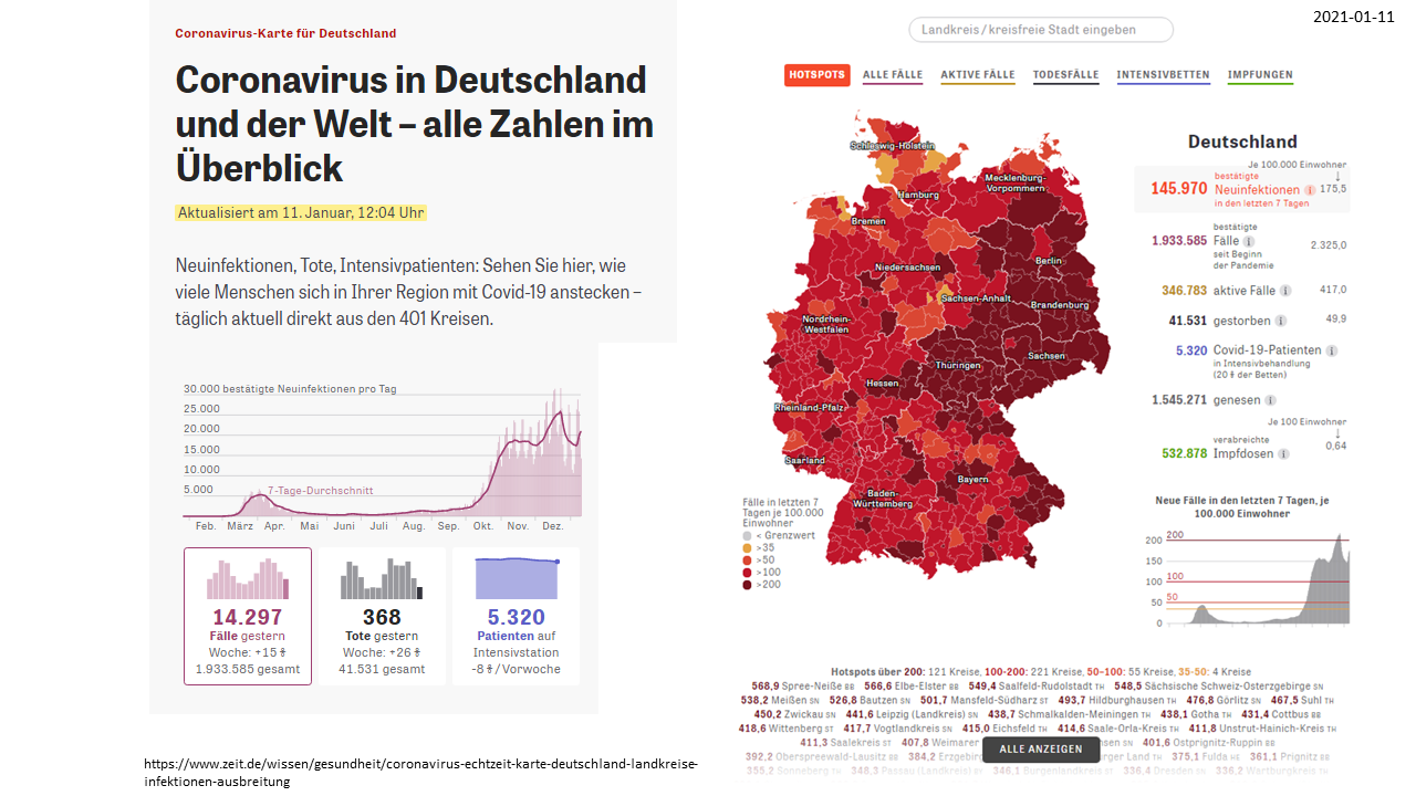
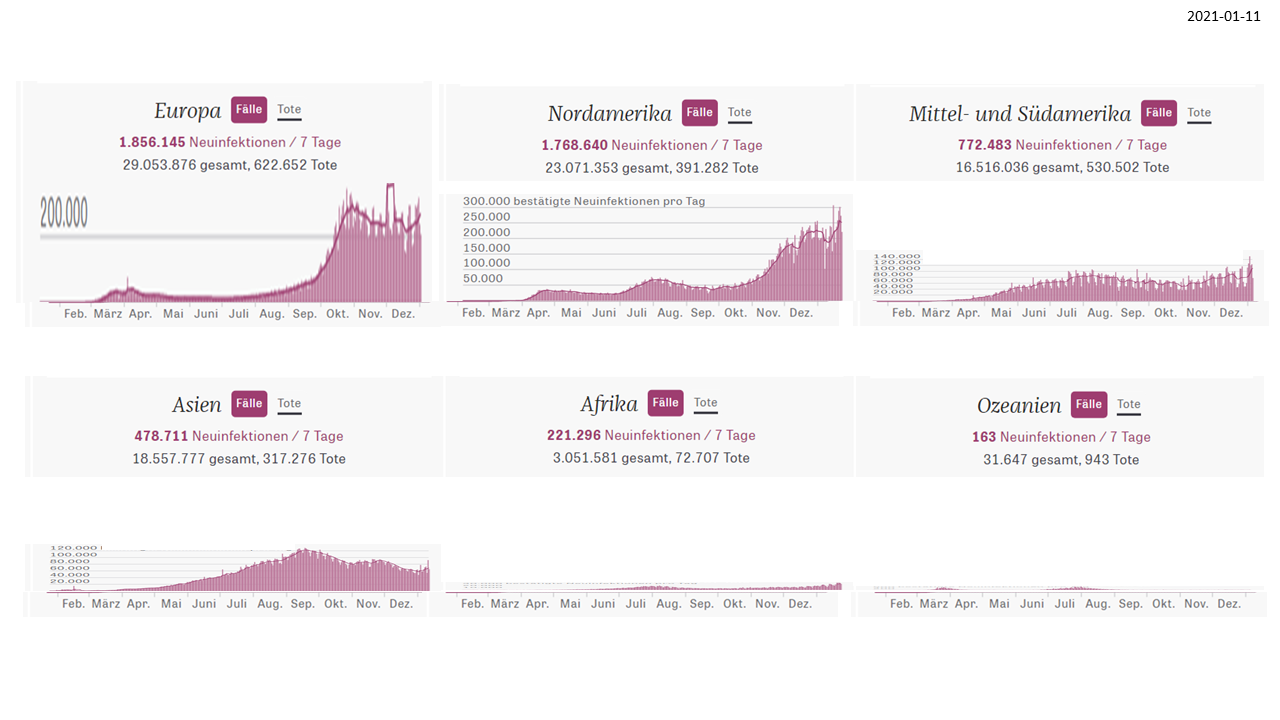
the theme of visualization of Covid-19-Data continues with the ongoing pandemic. Most of us never could imagine that this virus within his
almost 1 year of existence could have infected more than 90 million people
worldwide and caused the loss of more than 2 million lifes on earth.
If we see the numbers in charts we rarely can imagine
the impact of the disease on the different levels like continental, regional
and per country.
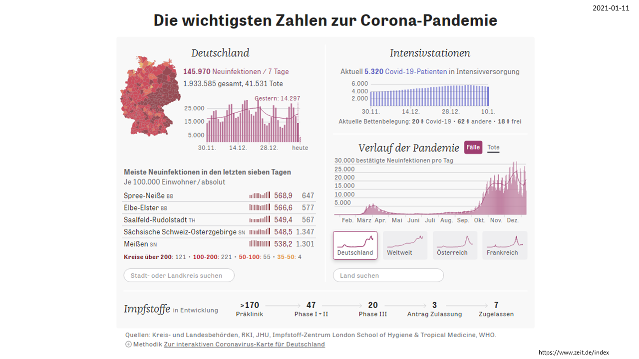
What can we see is that certain charts changed their
layouts by time. For example the German overview chart received a new item on “vacine”
due to the fact that there are now several vacines available and the number of
infections should decrease within a certain space of time.
When looking at the curves of regional and country
based overviews we can observe that it is almost impossible to compare their magnitudes
as they apply different scales of measure.
An important step in getting insights is comparing
data. Comparing could be done by putting charts of different countries or
regions into one overall chart. When we do this, as can be seen, correct
scaling becomes crucial.
Without scaling we can follow the curves and get an
idea of the trends over time, but fails to compare one with each other. But we
should do this, because without comparing we won’t formulate important questions
like ”why are incidences in Asia compared to the Americas and Europe are so
low?” and start investigating the reasons for those facts.




the curves tell a trend - but not a comparable magnitude


An Heiligabend 2020 haben sich die beiden Streitparteien Grossbritannien und EU doch noch auf einen geregelten Brexit einigen können.
Aus der unten dargestellten Grafik lässt sich auch zumindest im Ansatz erkennen, was denn für beide Parteien in bezug auf ihre Handelsbeziehungen auf dem Spiel stand.

Unter dem Gesichtspunkt einer gelungenen Datenvisualisierung hätte diese Darstellung jedoch durchaus etwas detaillierter sein können, um einen schnelleren und prägnanteren Überblick über die Sachlage zu bekommen. Wie die nachfolgenden Abbildungen zeigen, können Prozentanteile und Abweichungen sehr hilfreiche Darstellungsmittel sein.

Die nachfolgende Grafik ist zwar nicht IBCS-kompatibel, aber dennoch sehr kreativ....

Quelle: CDU:Männlich, ländlich, unsicher Von Mariam Lau,
Interessant wäre auch, dies noch für die restlichen im Bundestag vertretenen Fraktionen zu erstellen.

Já em junho este ano foi publicada na sua 31ª edição a mais nova Pesquisa Anual do Uso de TI da FGV/EAESP sob coordenação do Prof. Fernando S. Meirelles.
Trata-se de
uma peça muito importante nas pesquisas sobre o uso de TI no Brasil. Pois
através de sua longa existência poe muita luz na evolução do mercado de TI nas
empresas brasileiras e ajudando pesquisadores e decision makers em se orientar
melhor.
Porém, como
profissional na area de visualização de dados me pergunto com cada nova edição,
de como é possível pôr tão pouco enfase na questão da apresentação dos
dados. Não conheço os motivos de continuar com os mesmos tipos de gráficos e
layouts, mas talvez há de repente como explicação algumas barreiras da própria
tecnologia de informação tais como templates antigos em Excel com as quais
ninguem quer mexer ou fazer alterações.
Tenho a
impressão que o foco desta pesquisa concentra-se mais no levantamento,
processamento e interpretação dos dados do que na sua visualização, da
legibilidade e do rápido entendimento dos fatos apresentados. Talvez os
leitores da pesquisa e o enorme número de veiculos de publicação atingidos
tenham-se tanto acostumados nos últimos 31 anos ao estilo de visualização se no
caso de uma modernização e aplicação de metodos de visualização mais atuais
deixaria este público muito assustado. Mesmo assim sugere-se “uma pequena
revolução” em analisar o uso dos conceitos de visualização de dados de um
Stephen Few (http://perceptualedge.com/),
Nicole Nussbaumer (http://www.storytellingwithdata.com/)
ou da Associação dos International Business Communication Standards (IBCS) (https://www.ibcs.com/) para as próximas
edições.
https://eaesp.fgv.br/sites/eaesp.fgv.br/files/u68/fgvcia2020pesti-ppt_0.pdf
https://eaesp.fgv.br/sites/eaesp.fgv.br/files/u68/fgvcia2020pesti-resultados_0.pdf