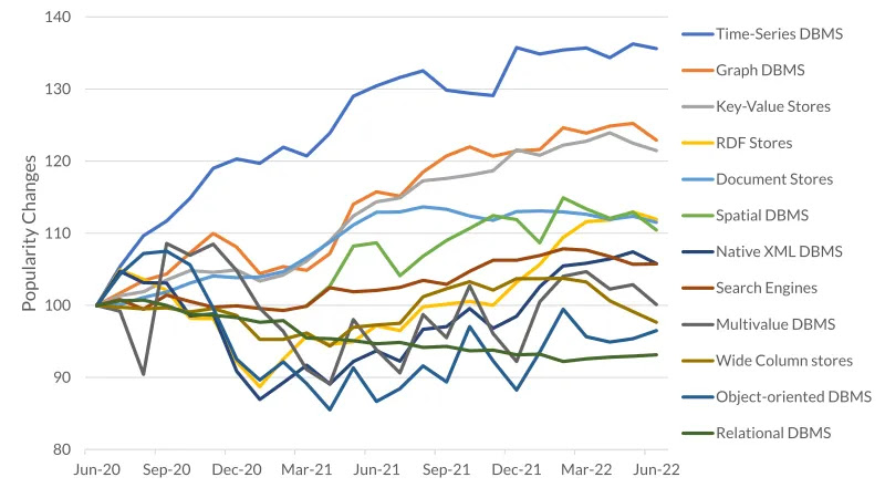
As can be seen there are quite a lot of chart types available.

Some are less useful as radar charts for example.

Some are better for use as line chart if applied correctly as seen on the right side, avoiding spaghetti charts.

On a first look it seems that in the following KPI-chart there have been applied bars. Actually only rectangular boxes were used with the value numbers inside.

For a better visualisation and faster understamding of the numbers it is very useful to replace the rectangular boxes by real scaled bars. Thus not only the relation between the variables can be displayed but also their metrics and types, for example absolute values or percentages.

We can also introduce comparisons and highlight differences by colors.

It is not only the correct choice of chart types, but also the application of design principles as simplicity, structure, avoidance of glitter and noise which makes a good visualisation of information, as can be seen in the example below.