segunda-feira, 24 de fevereiro de 2020

A nice place to go...

If you have some spare time and want to get inspired by data visualization themes, have a look at
https://www.visualcapitalist.com

Visualizing the Biggest Risks to the Global Economy in 2020 (https://www.visualcapitalist.com/biggest-risks-global-economy-2020-environment/) shows some nice ways to warn about the growing environmental impacts on global economy.

What do you think about the chart forms they used?


sexta-feira, 31 de janeiro de 2020

Charts of the Month

Dashboards


Line charts


Columns


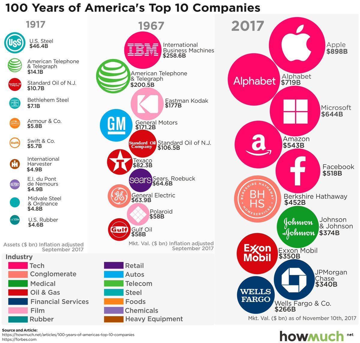
Bubbles


and at last two correct and impressive visualizations


Geographical Data Visualization

Geographical data visualization in maps is a helpful way to show at a glance the importance of certain situations.
The following maps show the worldwide distribution of submarine cables. We should also bear in mind, that still about 90% of the internet traffic runs via cables....


www.submarinecablemap.com 

segunda-feira, 30 de dezembro de 2019

Comparisons

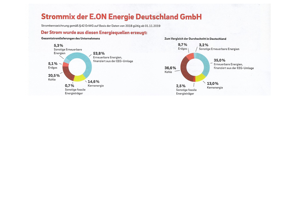
Using pie or donut charts for comparisons is still common in business communication as we can see below. 


The same data in a single bar chart helps understanding more easily.
By the way the chart below was made with chart-me.com, an easy to use online tool. 


And the following chart I don't understand. Maybe someone could help me explaining the meaning. 

quarta-feira, 20 de novembro de 2019

News from chart-me.com

chart-me.com keeps growing with new promissing chart features, although not yet available...


Bullet graph columns bars


and off course it will be worth waiting for Area, Bubble and Scatter chart types....


chart-me.com


SOLID | OUTLINED | HATCHED (BOOK)

SOLID | OUTLINED | HATCHED (BOOK)

now worldwide available in english....


https://www.ibcs.com/product/solid-outlined-hatched-book/


terça-feira, 1 de outubro de 2019

Symbols and measures in financial reporting

In their digression 2.8 to chapter 2 of their book “ Filled, outlined, hatched”,  Hichert&Faisst write about some exciting forms of visualizations for measures and indicators in financial reporting.
Indeed this is still a vast area for future development and could be generally accepted like for example the use of symbols in thematical maps.


As suggested by  Hichert$Faisst turnover could be represented by a Ʌ, the cost by V and the result by something like Ꜻ or ˄˅.   

Especially on a international level business communication could be substantially improved.


The german version can be found here:


www.ibcs.com

https://books.google.de/books/about/Gef%C3%BCllt_gerahmt_schraffiert.html?id=yAfBvgEACAAJ&redir_esc=y

https://www.amazon.de/Gef%C3%BCllt-gerahmt-schraffiert-Einheitlichkeit-Pr%C3%A4sentationen-ebook/dp/B07RFQ7S1L