terça-feira, 25 de agosto de 2020

Charts and Tables in Annual Reports II

 In the last edition we showed some examples of charts and tables in annual reports. As can be seen, the charts used by the companies don't facilitate the understanding of information and underlying text. It seems that annual reports are considered more as a medium for PR effects and for "book readers" than for fast and detailed information means.

Our new examples show that in other segments like communication and media this behavior prevails.


Annual Report 2019  NZZ Mediagruppe


Charts


Tables


terça-feira, 28 de julho de 2020

Charts and Tables in Annual Reports


These are the basic chart types used in the Daimler AG Annual Report from 2019.
It seems that the designers of the report didn't care much about readability and understanding of the numbers. Following the tendency of many words and few charts in annual reports they believe that investors prefer reading long texts than viewing smart understandable charts....


At the end of the report we find a ten-years data overview which could have been served as a nice base for smart and interesting time-series charts, comparisons and multiple charts...


quarta-feira, 3 de junho de 2020

IBCS-like Corona Charts

Neben den vielen nationalen und internationalen Dashboards zur Corona-Pandemie gibt es zwischenzeitlich auch einige Darstellungen, die den IBCS-Graphiken ziemlich ähnlich sind.
Doch bei genauerem Hinsehen gibt es hinsichtlich einer IBCS-Compliance doch noch kleine Differenzen....


                                                                                                                           Rems-Zeitung, 9./10.05.2020

Verbesserungswürdige Punkte in Zeitungsgrafik und wie sie realisiert werden könnten:
Nachbau nach IBCS jedoch ohne Absolutwerte


 Konzentration auf Aktuell- und Vorperiodenbetrachtung

Aktuell- und Vorperiodenbetrachtung mit Abweichungen mit zwei Fallzahlenkategorien

Aktuell- und Vorperiodenbetrachtung mit Abweichungen für Fallzahlenkategorie Verstorbene


Problem der Skalierung bei absoluten Werten wird sichtbar bei Betrachtung der Fallzahlen für
Neuinfizierte und Verstorbene

IBCS-konformer Nachbau obiger Zeitungsgrafik.


sexta-feira, 1 de maio de 2020

Desertification in Germany?


„Ein Bild sagt mehr als tausend Worte“ – wird sich auch der Verfasser von Portalsolar.com.br bei der Erstellung dieser Nachricht gedacht haben.
Unabhaengig voneinander betrachtet handelt es sich um ein schoenes Bild mit einer erfreulichen Mitteilung („Deutschland verzeichnet in den ersten drei Monaten des Jahres 50 % des Stroms aus erneuerbaren Quellen.“)


Aber was hat dies nun mit Informationsvisualisierung zu tun?
Ziemlich viel, denn Beides zusammen kann beim Betrachter zu voellig falschen Assoziationen und Interpretation fuehren.
Weshalb?  
  • Deutschland ist kein Wuestenland wie auf dem Bild dargestellt. Aus welcher Region die Aufnahme stammt ist leider nicht zu erkennen. Vielleicht koennte es ja Nordafrika sein?
  • Es stimmt, dass in den ersten Monaten des Jahres 2020 ueber 50% der Nettostromproduktion aus erneuerbaren Quellen stammten. Erneuerbare Energie in der Bildunterschrift wird aber durch das Bild mit Solarenergie gleichgesetzt. Fakt ist jedoch, dass 35,4 % der Nettostromproduktion im Zeitraum durch Windkraft erzeugt wurde und nur 8,4% durch Sonnenenergie.

Also Vorsicht bei der Bildauswahl und Texten..... Check first.


https://www.energy-charts.de/energy_pie_de.htm?year=2020


2019 war in vielen Regionen Deutschlands ein sehr trockenes Jahr was die Gesamtbodenfeuchte anbelangt.


https://files.ufz.de/~drought/Gesamtboden_historisch_12_mon.zip


Es wird heisser und trockener, zumindest seit 2010.... Aber bis zur Wuestenbildung dauert es noch etwas.


Evolution in maps

Maps are the right choice for displaying geographical facts as we can see in the following figure,


But it becomes a bit difficult when we try to show the dynamics in a timely evolution. Colors and categorization have to be standardized, otherwise presentation becomes confusing.


terça-feira, 28 de abril de 2020

Unifying presentations

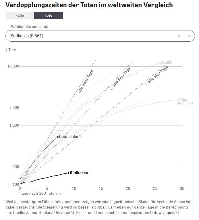
The last chart in last months contribution showed a timely presentation of the total number of worldwide infections.


For a timely presentation it would be better to show the bars on a x-axis. It would be also interesting to show the most affected countries in relation to the worldwide total and applying unique scaling.


The following chart shows an attempt to resolve this. 
For better understanding it is not necessary to show in each chart all the lines of the other countries. Removal of background color and redundant labelling could also facilitate a better reading.     


https://www.ft.com/coronavirus-latest


terça-feira, 31 de março de 2020

Covid-19 data visualization


The following picture sequence shows how some main german online news site visualize corona data. Some process publicly available data into their own charts whereas others use dashboards from international organisations or research institutions.  One may ask which type of visualization is used by the experts for decision making.


 https://experience.arcgis.com/experience/685d0ace521648f8a5beeeee1b9125cd


https://experience.arcgis.com/experience/478220a4c454480e823b17327b2bf1d4

https://www.spiegel.de/wissenschaft/medizin/coronavirus-infizierte-genesene-tote-alle-live-daten-a-242d71d5-554b-47b6-969a-cd920e8821f1


 https://www.zeit.de/wissen/gesundheit/2020-03/coronavirus-deutschland-infektionen-faelle-verbreitung-epidemie-karte#karte


https://www.zeit.de/wissen/gesundheit/2020-03/coronavirus-ausbreitung-zeitverlauf-landkreise-staedte-karte

 https://www.rki.de/DE/Content/InfAZ/N/Neuartiges_Coronavirus/Fallzahlen.html


 https://www.zeit.de/wissen/gesundheit/2020-03/coronavirus-ausbreitung-zeitverlauf-landkreise-staedte-karte


https://experience.arcgis.com/experience/685d0ace521648f8a5beeeee1b9125cd