As normas do IBCS agora também estão representadas
no num front-end de BI da SAP – o SAPAnalyticsCloud. O expert Ingo Hilgefort mostra numa série
de cinco artigos como os “Top 10 IBCS Standardization Elements” podem ser
entendidos e como se encaixam dentro do SAPAnalyticsCloud.
segunda-feira, 2 de abril de 2018
sábado, 24 de fevereiro de 2018
Scaling – cut the axis...
Scaling is a very important item of the IBCS rules. When it comes to
present extreme values for example very high income in one region and very low
in other regions the normal way in a column chart was to cut the
column in the middle applying a symbol like that //
Not necessarily the
best solution as we lose the magnitude relation between the charts.
By introducing a scaling area as shown in the next chart we maintain the relations and the reader still can imagine the proportions.
The next chart shows a very “tricky” way to solve the problem. Instead
of cutting the column just cut the x-axes. As we can see by applying this we
maintain the same proportions and everything fits in the chart.
segunda-feira, 19 de fevereiro de 2018
About line charts
About two
months ago at www.storytellingwithdata.com there was a contest about annotated
line charts and almost 100
contributions were accepted.
As we can see there wasn’t that much creativity
involved.
New
approaches like multicharts with/and “timelines” are very rare.
![]() |
https://www.bloomberg.com/news/articles/2016-06-13/we-ve-almost-reached-peak-fossil-fuels-for-electricity
segunda-feira, 22 de janeiro de 2018
And here are the good news: IBCS goes mainstream
The first good news is that SAP Analytics Cloud is now IBCS/Hichert certified.
For those
interested in applying visualization standards in their reports SAP offers now
within their Analytics Cloud IBCS compliant charts.
It is no
longer necessary to use third party tools within your SAP environment in order
to produce highly sophisticated reports and dashboards.
For more
information see the article of Blaž Zabukovec (https://www.linkedin.com/pulse/sap-analytics-cloud-now-ibcshichert-certified-success-blaž-zabukovec/)
the official SAP announcement
https://www.sapanalytics.cloud/ibcs-certification/
and some chart examples on hichert.com (https://www.hichert.com/software/sap-analytics-cloud/).
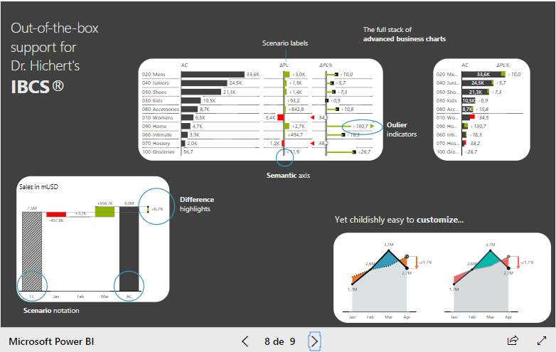
ZebraBI-PBI
The second
good news comes from ZebraBI which now offers a visuals add-on for Microsoft
PowerBI. The fast growing PowerBI community can now use sophisticated
IBCS-charts for reporting and dashboard design. As can be seen on a recently
held Webinar (https://zebrabi.com/power-bi-webinar/#av_section_2)
ZebraBI custom visuals do a great job in accelerated dashboard design.
For more
information see https://zebrabi.com/pbi/
Marcadores:
business charts,
business reports,
Daikcon,
MS-PowerBI,
SAP Analytics Cloud,
SUCCESS,
templates de gráficos,
visualização de dados financeiros,
ZebraBI
quinta-feira, 28 de dezembro de 2017
Charts of the Month - II
Maybe one of the first known "Spaghetti"-Charts. A very impressive chart made by William Playfair some 200 years ago.
Assinar:
Postagens (Atom)