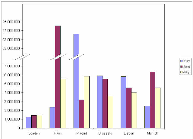
Scaling is a very important item of the IBCS rules. When it comes to
present extreme values for example very high income in one region and very low
in other regions the normal way in a column chart was to cut the
column in the middle applying a symbol like that //
Not necessarily the
best solution as we lose the magnitude relation between the charts.
By introducing a scaling area as shown in the next chart we maintain the relations and the reader still can imagine the proportions.
The next chart shows a very “tricky” way to solve the problem. Instead
of cutting the column just cut the x-axes. As we can see by applying this we
maintain the same proportions and everything fits in the chart.


