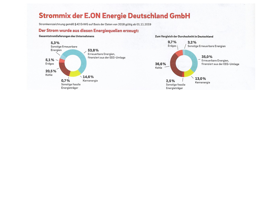
Using pie or donut charts for comparisons is still common in business communication as we can see below.
The same data in a single bar chart helps understanding more easily.
By the way the chart below was made with chart-me.com, an easy to use online tool.

And the following chart I don't understand. Maybe someone could help me explaining the meaning.
