Nach Stromausfällen
China genehmigt Dutzende neue Kohlekraftwerke
In der Volksrepublik bahnt sich ein neuer Kohleboom an: Offenbar will der weltgrößte CO₂-Emittent mit weiteren Meilern seine eigene Energiekrise bekämpfen – ein herber Rückschlag für den Kampf gegen die Klimakatastrophe.


.jpeg)
%20-%20Kopie.jpeg)
%20-%20Kopie.jpg)
%20-%20Kopie.png)

.jpg)


.png)
.jpeg)
.jpg)


.jpg)


.jpeg)

.jpg)

.jpg)


...und was wir davon zu erwarten haben:

Schneebedeckung in den Alpen im Januar 2023
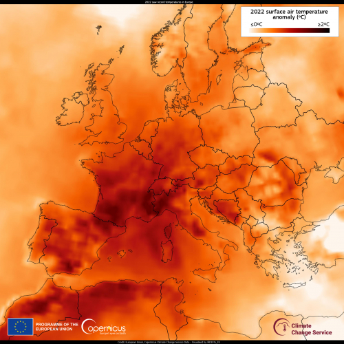
Temperaturanomalien 2022 in Europa

Temperaturanomalien im Januar 2023

Wasserführung des Po im Feb 2023

Schneebedeckung am Neujahrstag 2023 in Europa