terça-feira, 1 de outubro de 2019

Symbols and measures in financial reporting

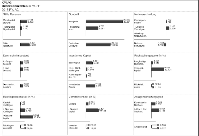
In their digression 2.8 to chapter 2 of their book “ Filled, outlined, hatched”,  Hichert&Faisst write about some exciting forms of visualizations for measures and indicators in financial reporting.
Indeed this is still a vast area for future development and could be generally accepted like for example the use of symbols in thematical maps.


As suggested by  Hichert$Faisst turnover could be represented by a Ʌ, the cost by V and the result by something like Ꜻ or ˄˅.   

Especially on a international level business communication could be substantially improved.


The german version can be found here:


www.ibcs.com

https://books.google.de/books/about/Gef%C3%BCllt_gerahmt_schraffiert.html?id=yAfBvgEACAAJ&redir_esc=y

https://www.amazon.de/Gef%C3%BCllt-gerahmt-schraffiert-Einheitlichkeit-Pr%C3%A4sentationen-ebook/dp/B07RFQ7S1L


domingo, 22 de setembro de 2019

Why the CHECK rule of IBCS is important....

Sharpie makes the difference


Some chart examples


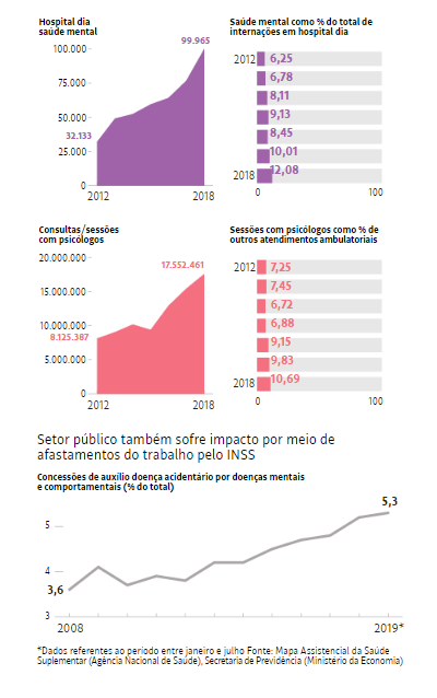
The following charts follow in a good way the priniple of information density presenting various thematical aspects on one page. On the other hand shows some deficiencies regarding the scaling and time and structure rules of IBCS. The chart on the right side is also a time presentation and thus should be shown in a time series as the left chart. For better understanding the percentages could be placed in the left chart building a combination chart. Or even above the area chart using a line chart for example. Thus all the page width could be used as for example shown in the chart at the bottom.
The most problematical visualization point is that scaling is obviously totally neglected. All 4 area charts deal with number of services and vary from 100 000 to 25 million service calls. In order to see the real situation the charts should show the vast differences by using a correct scaling.


The following chart is much better because it follows the rules of correct scaling.
And thus beyond being impressive also becomes reliable. 
For better orientation it could have been helpful to mark the year when the uninterrupted population increase started. 


domingo, 11 de agosto de 2019

domingo, 7 de julho de 2019

Self-service Business Charts and Dashboards

At the IBCS annual Conference 2019 in Vienna chart-me.com was presented. A really impressive approach to generate self-service business charts according to the IBCS standards providing just some data in XL.


Just link to the site, select your favorite charts which attends best your information needs, download the xls-file, fill it with your data, upload the xls-file and generate your chart. Then save/export it in your prefered format. That's it.


chart-me.com


domingo, 30 de junho de 2019

IBCS-Conference 2019 in Vienna

On friday 28th of June the annual IBCS-Conference 2019 took place in Vienna showing interesting new products and an impressive number of high class contributions on visualizations, business communications and information design.
Keynote speaker Yuri Engelhardt impressed with his "language of graphics" and "the DNA of visualization". "IBCS got Talent" showed how IBCS compliant projects can be designed and elaborated within a short time. ibcs-annual-conference-2019 (https://www.ibcs.com/seminar/ibcs-annual-conference-2019/)

Join the group and become a member of the IBCS association. Register now for free.


Viena 28th June 2019


With SUCCESS to IBCS

Yuri Engelhardt


The DNA of Visualisations


Gold Sponsor HighCoordination with IBCS compliant Software TrueChart